There is a moment of horror that every graphic designer experiences at least once in their career. It usually happens at the print shop counter. You've just spent two weeks perfecting a brand identity on your $3,000 MacBook Pro. The electric blue logo pops off the screen; the neon green accents practically glow. It is a digital masterpiece.
Then, the printer hands you the proof.
Your heart sinks. The electric blue is now a sad, muddy navy. The neon green looks like split pea soup. The vibrancy has been sucked out of your work, leaving a dull, lifeless shadow of your original vision.
What went wrong? You didn't just make a settings error; you crashed headfirst into the laws of physics. You tried to speak the language of Light (RGB) to a machine that only speaks the language of Pigment (CMYK).
In this comprehensive guide, we are going to bridge the gap between screen and paper. We’ll explain the science simply, walk you through the professional "Soft Proofing" workflow, and show you how to handle the massive file sizes that come with high-quality print work using NanoZipt.
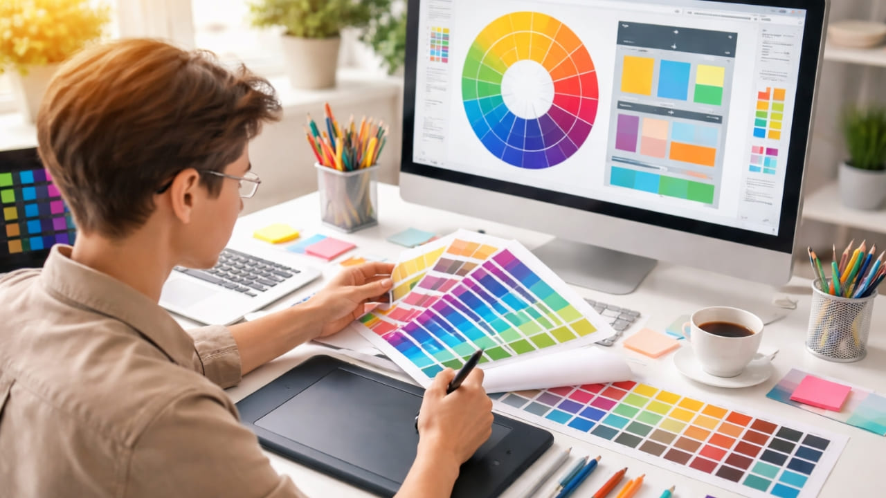
The Light Bulb vs. The Crayon: A Simple Analogy
To fix your prints, you first need to understand why the colors shift. It comes down to how colors are created.
RGB: The Additive Model (Light)
Imagine you are in a pitch-black room. To create color, you turn on flashlights.
- Red, Green, Blue.
- If you turn them all on at full power, they combine to make pure White light.
- This is your computer screen. It can create millions of colors, including incredibly bright, saturated neons, because the light is projected directly into your eyes.
CMYK: The Subtractive Model (Ink)
Now, imagine you are painting on a white sheet of paper. To create color, you smear ink on it.
- Cyan, Magenta, Yellow, Key (Black).
- The more ink you add, the darker it gets. If you mix C, M, and Y together, you don't get white; you get a muddy brown.
- Paper cannot glow. It can only reflect the ambient light in the room.
The Reality Check: The "gamut" (range of colors) of RGB is much larger than CMYK. There are colors on your screen that literally cannot exist in ink. When you print, the machine has to find the "nearest neighbor" for those bright colors, which is why they turn muddy.
The Professional Workflow: From Pixel to Paper
Now that we know the enemy, how do we defeat it? Follow this checklist for every print project to ensure what you see is what you get.
1. Don't Start in CMYK (Surprise!)
Many old-school designers tell you to set your Photoshop canvas to CMYK immediately. We disagree. Working in CMYK mode disables many of Photoshop's best filters and blending modes.
The Better Way: Design in RGB mode to keep your file flexible. However, you must use "Soft Proofing."
- Go to
View > Proof Setup > Working CMYK. - Press
Ctrl + Y(or Cmd + Y on Mac).
Your screen will instantly shift to simulate how the design will look on paper. The neons will dull. The blues will flatten. This is good. It allows you to adjust the saturation and brightness while still in RGB mode to compensate for the dullness, rather than being surprised later.
2. The Mystery of "Rich Black"
If there is one thing that screams "amateur designer," it is the misuse of black ink. In RGB, Black is just Black (0,0,0). In print, there are two distinct types of black:
- Standard Black (K:100): This uses only the black ink cartridge. It is perfect for text (12pt or smaller) and fine lines. However, if used for a large background, it will look dark gray or washed out because the white paper shows through slightly.
- Rich Black (C:60, M:40, Y:40, K:100): This mixes all the colors to create a deep, void-like black. Use this for large backgrounds or bold headlines.
Warning: NEVER use Rich Black for small text. If the printer's plates are misaligned by even a fraction of a millimeter (registration error), your text will have fuzzy pink and blue ghosting around the edges, making it unreadable.
3. Resolution and The 300 DPI Rule
Screens look great at 72 DPI (Dots Per Inch). Print requires 300 DPI minimum.
If you grab a logo from a website and stretch it across a brochure, it will look pixelated and blocky (the dreaded "Minecraft effect"). Always ensure your source images are high-resolution. If you can't find a high-res version, scale the design down; never scale a raster image up.
The "File Size" Dilemma
You have followed the rules. You used high-res images (300 DPI), you added bleeds (standard 0.125"), and you converted your colors. You export your portfolio as a "Press Quality PDF."
Then you look at the file size: 450 MB.
You can't email a 450 MB file to a potential employer. You can't upload it to a job portal (most limit you to 5 MB or 10 MB). You are stuck with a beautiful portfolio that is too heavy to travel.
The NanoZipt Strategy: "The Brick vs. The Feather"
Professional designers actually maintain two versions of every document:
- The Brick (Print): The uncompressed, full-quality file. Keep this safe on your hard drive for the printer.
- The Feather (Digital): A lightweight version for emailing and viewing on screens.
To create "The Feather" without ruining your layout, use the NanoZipt PDF Compressor.
Unlike generic tools that just blurry your images, our algorithm intelligently downsamples 300 DPI images to 144 DPI (still crisp on Retina screens) and removes hidden metadata. We often reduce file sizes by 80-90% while keeping the text vector-sharp.
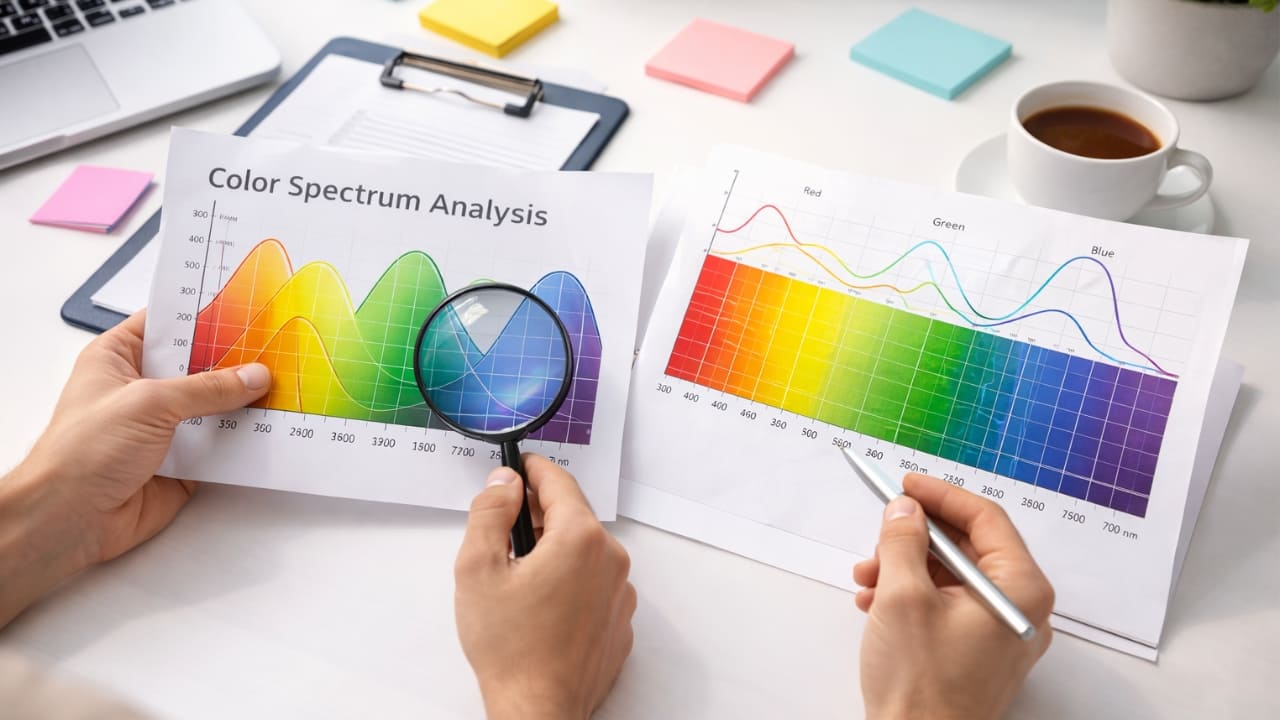
Bonus: Understanding Color Profiles (ICC)
If you want to get really technical, you need to know about ICC profiles. These are little data files embedded in your images that tell the printer exactly how to interpret color.
For general printing in North America, U.S. Web Coated (SWOP) v2 is the standard. In Europe, it is often FOGRA39. If you send a file with the wrong profile, colors can shift dramatically. Always ask your printer which profile they prefer before you export your final PDF.
Conclusion: Respect the Medium
Digital design allows us to be lazy with physics. We can use any color, any transparency, and any effect. Print demands respect. It requires you to think about ink density, paper absorption, and mechanical precision.
By understanding the limitations of CMYK, managing your black levels, and using smart compression tools like NanoZipt to handle your logistics, you bridge the gap between the glowing screen and the tactile page. Your portfolio is your professional identity—make sure it looks intentional, sharp, and flawless, no matter the medium.